Dra Aline Fernandes
Peadiatric
The Brand
Doctor Aline Fernandes is a pediatric doctor caring for patients from 0-12 years old. Through the visual identity project of her brand, the physician wants to express the high level service she provides combined with her professional competence. On top of that, it was important to show her care for the patients.
Brand Atributtes
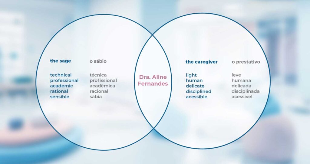
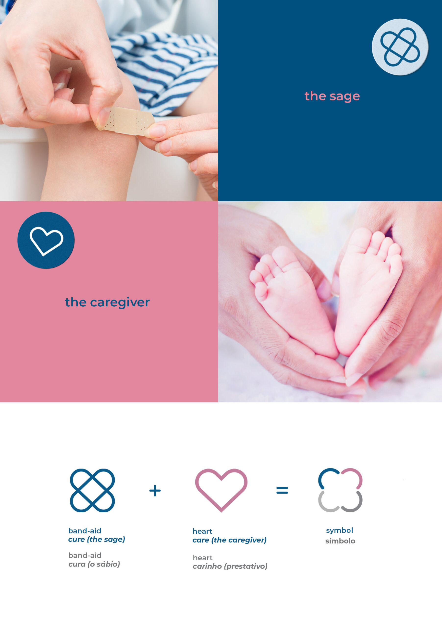
Through words selected by the professional, it was possible to identify two archetypes that fit her profile: the Sage and the Caregiver. The Sage has the gift of intelligence and confidence, aiming to achieve happiness through knowledge and truth. The Caregiver is an altruist, driven by compassion, generosity and a desire to help others. The combination of these two powerful archetypes embodies the personality of the professional.
SYMBOL
The Sage: The band-aid has been used since we were children as a bandage for wounds, cuts and injuries, bringing with it the childhood’s touch and also the science of healing.
The Caregiver: The heart refers to affection and increases the capacity to deal with a delicate and harmless audience.
The result of this combination is, coincidentally, a symbol that resembles a butterfly and a flower, which matches directly with the brand proposal, because according to the book Diccionário de los Símbolos (Chevalier, p.504), the butterfly carries the symbolism of metamorphosis, while a flower symbolizes love, harmony and childhood.
LOGO
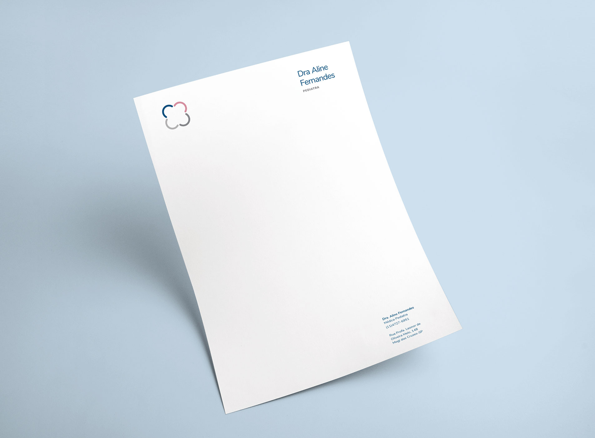
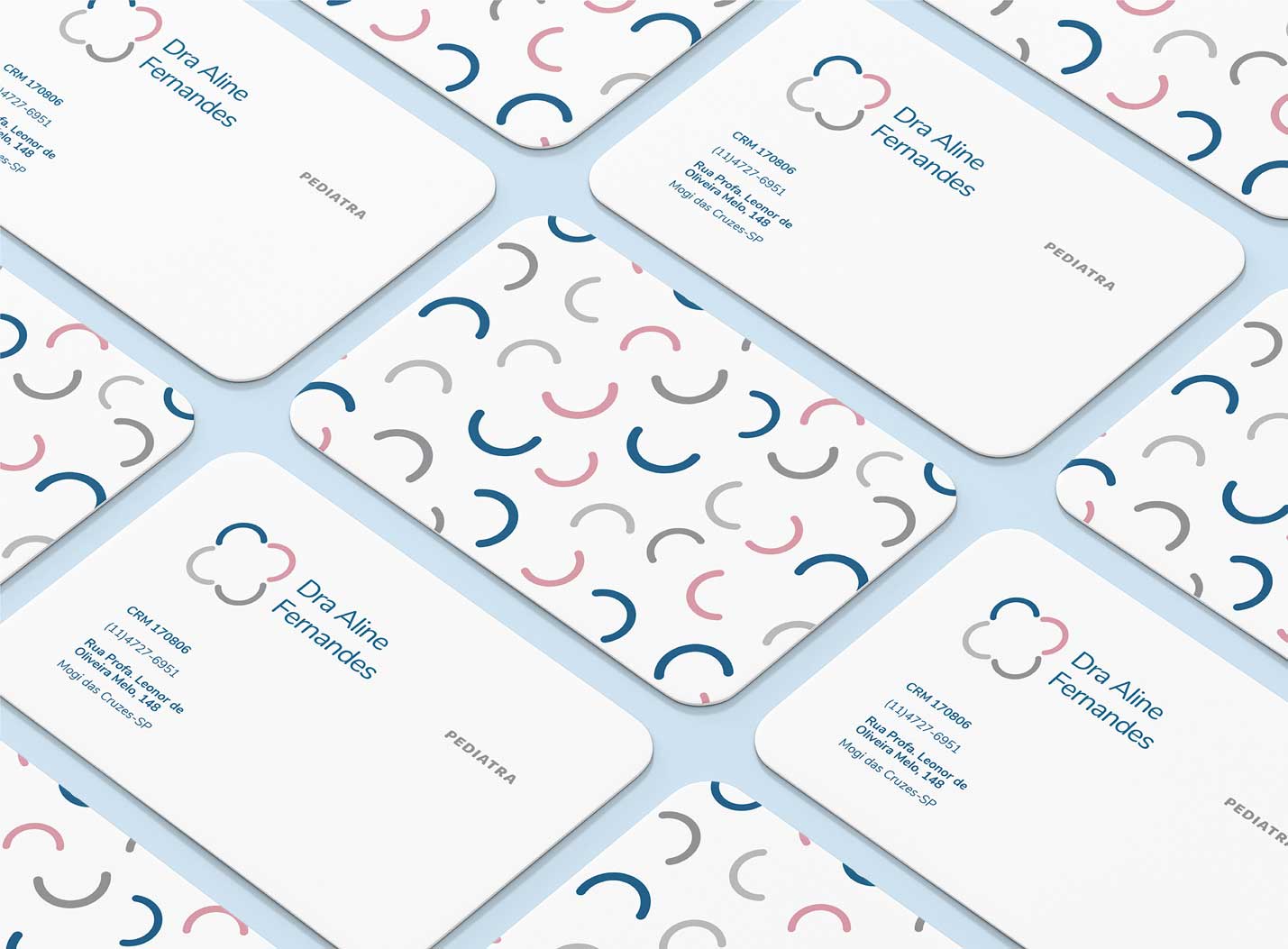
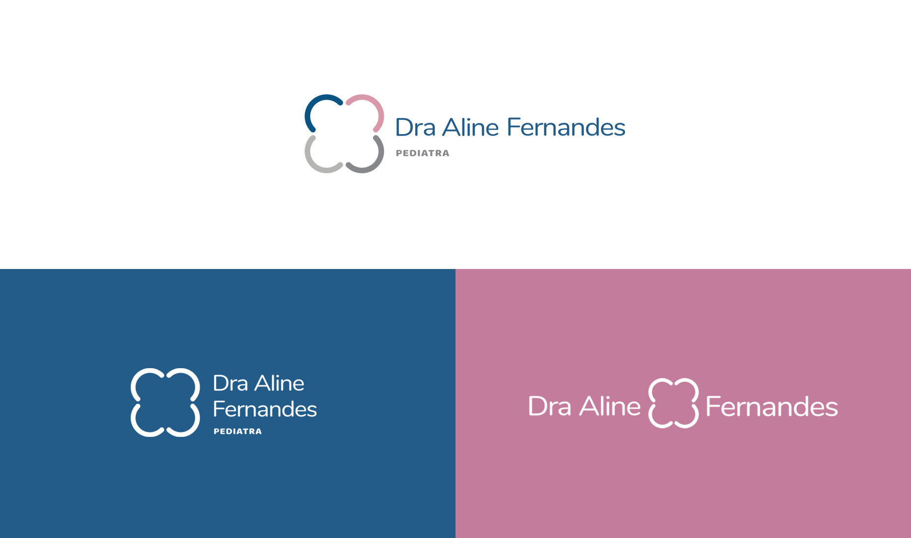
The logo is versatile, allowing it to be formatted in various ways alongside the brand symbol. Its main version should be on a white background with its horizontal structure and all the colors from the brand palette.
The Colours
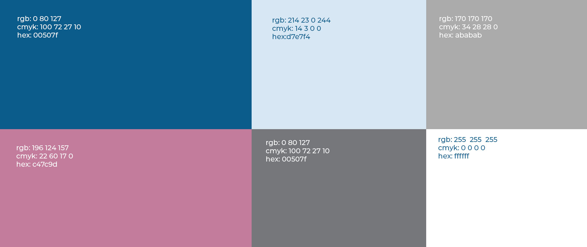
According to the book Psychology of Colors (Evan Heller), this chromatic composition symbolizes delicacy, associating, therefore, with the words related to the professional and her archetype. Furthermore, in childhood, the colours blue and pink are socially seen as colours related respectively to the boy and the girl.
